
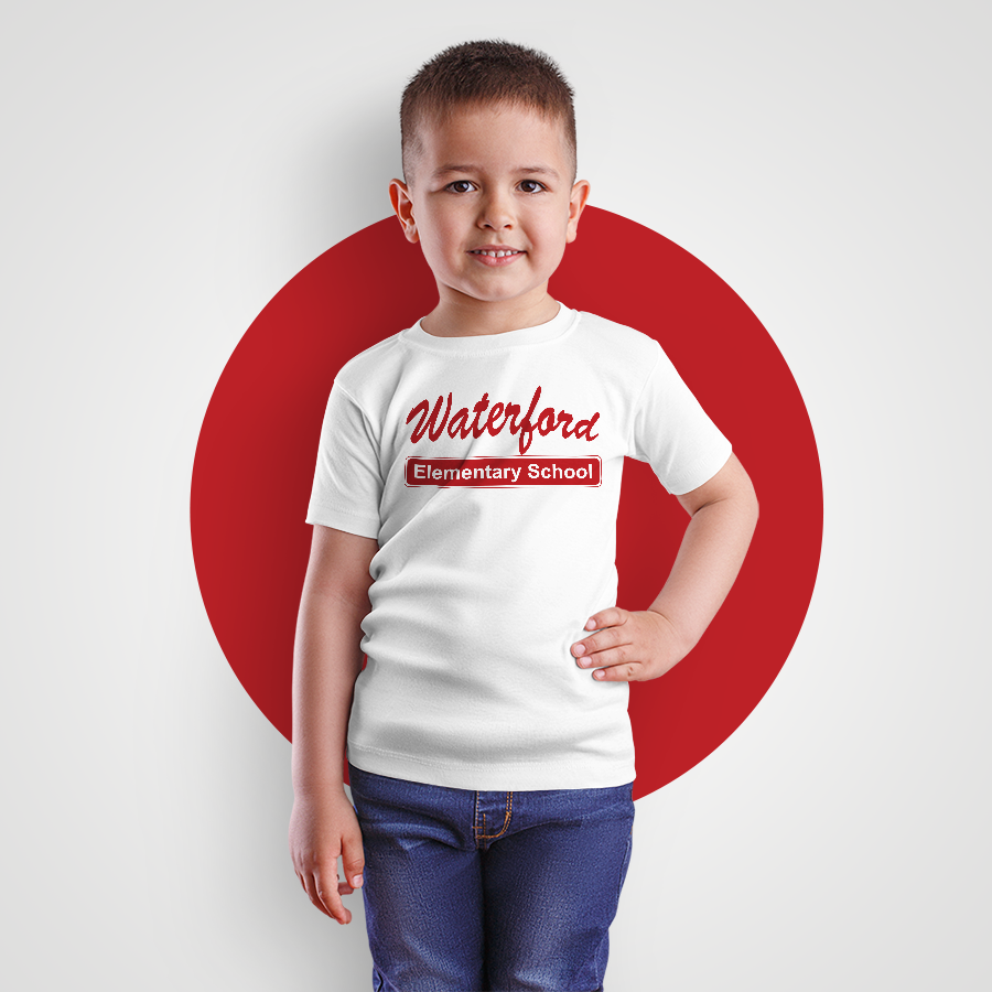
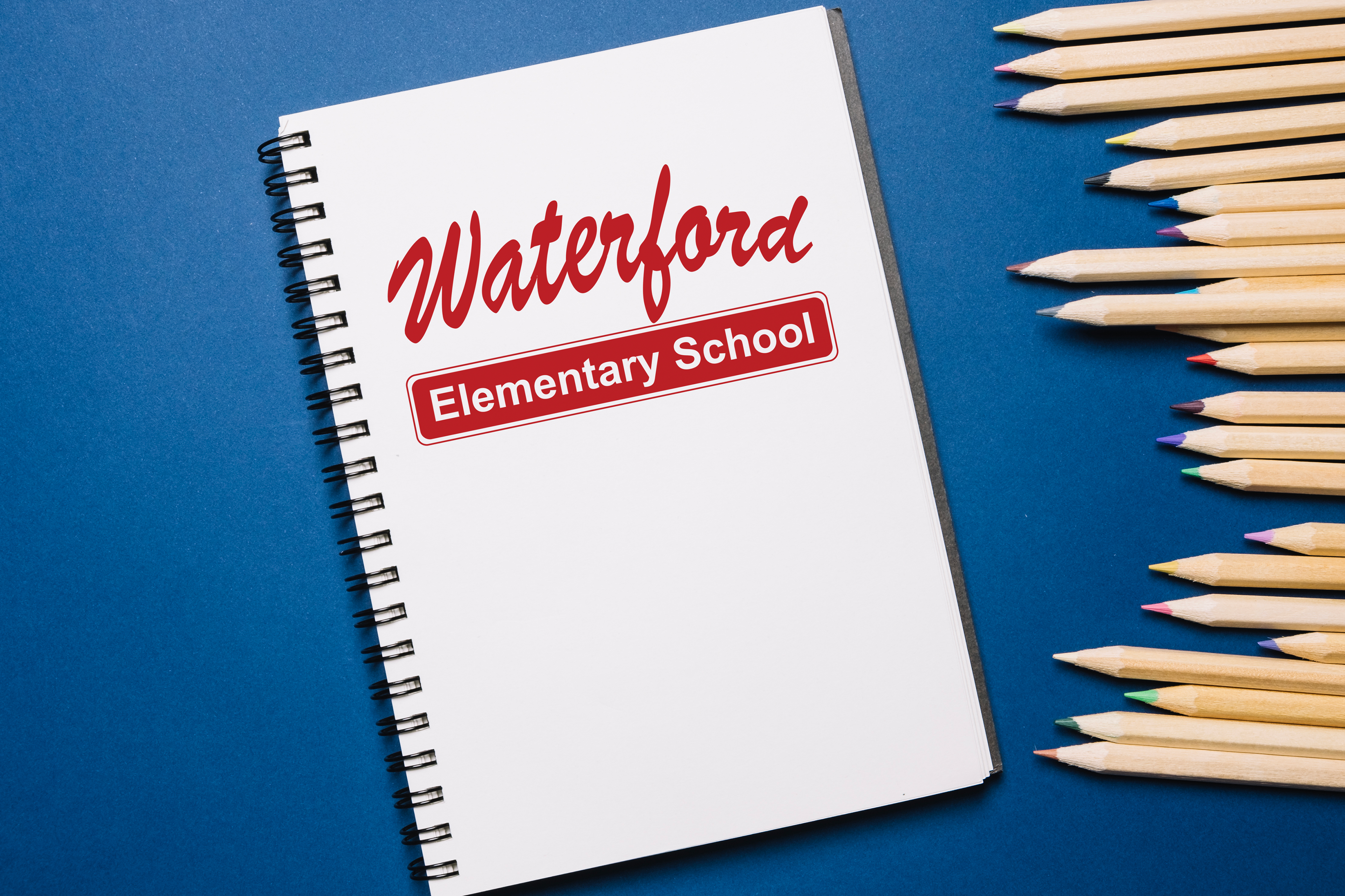
T-shirt and notebook design. The client wanted a classic design close to what they used previously. One-color was used for budget purposes, red was chosen since the school’s colors are red and white. Waterford is a script font and it's arched, Elementary School is Arial, and it's in bold for readability. Rounded rectangle and stroke of a rounded rectangle to look like the older designs and to add shape. Set up PDF and Illustrator files for printing. Designed a clean and simple layout for t-shirt orders as well. The target audience is children and their families.